5 updates
Welcome to the fourth issue of the Moda weekly update. Last week we added more ways to act on findings. This week we have focused on the dashboard you use to follow them.
In this update we will cover Home customization, choices for signal rates, and tasks in traces and search. We also changed user health and gave Problems its own page.
A Home page you can customize
Home now lets you pin signals, problems and custom checks. You can change their order and choose which sections appear.
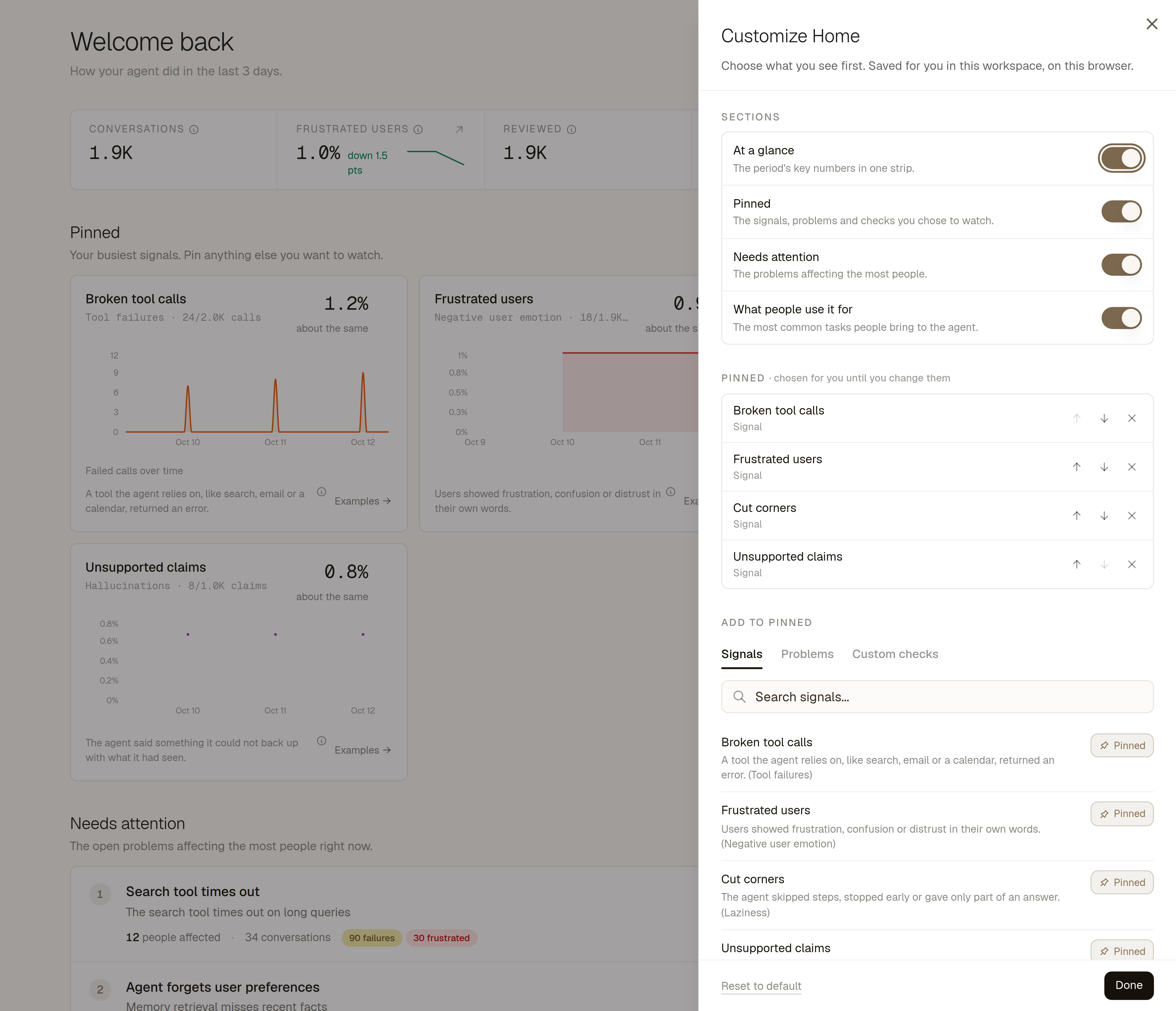
As we add more ways to understand your agents, Home needs to show the things you follow regularly. A pinned signal shows its rate and trend. Problems and custom checks can sit beside it, so you can return to the same findings without searching for them again.
Customize brings these controls into one panel. Your layout saves for you in the current browser and workspace. Each teammate can set up their own Home page.
The Needs attention section lists open problems by how many people they affect. You can pin a problem from that list.
More choice in signal rates
We have added a choice of units to signal rate cards. Each signal has its own options.
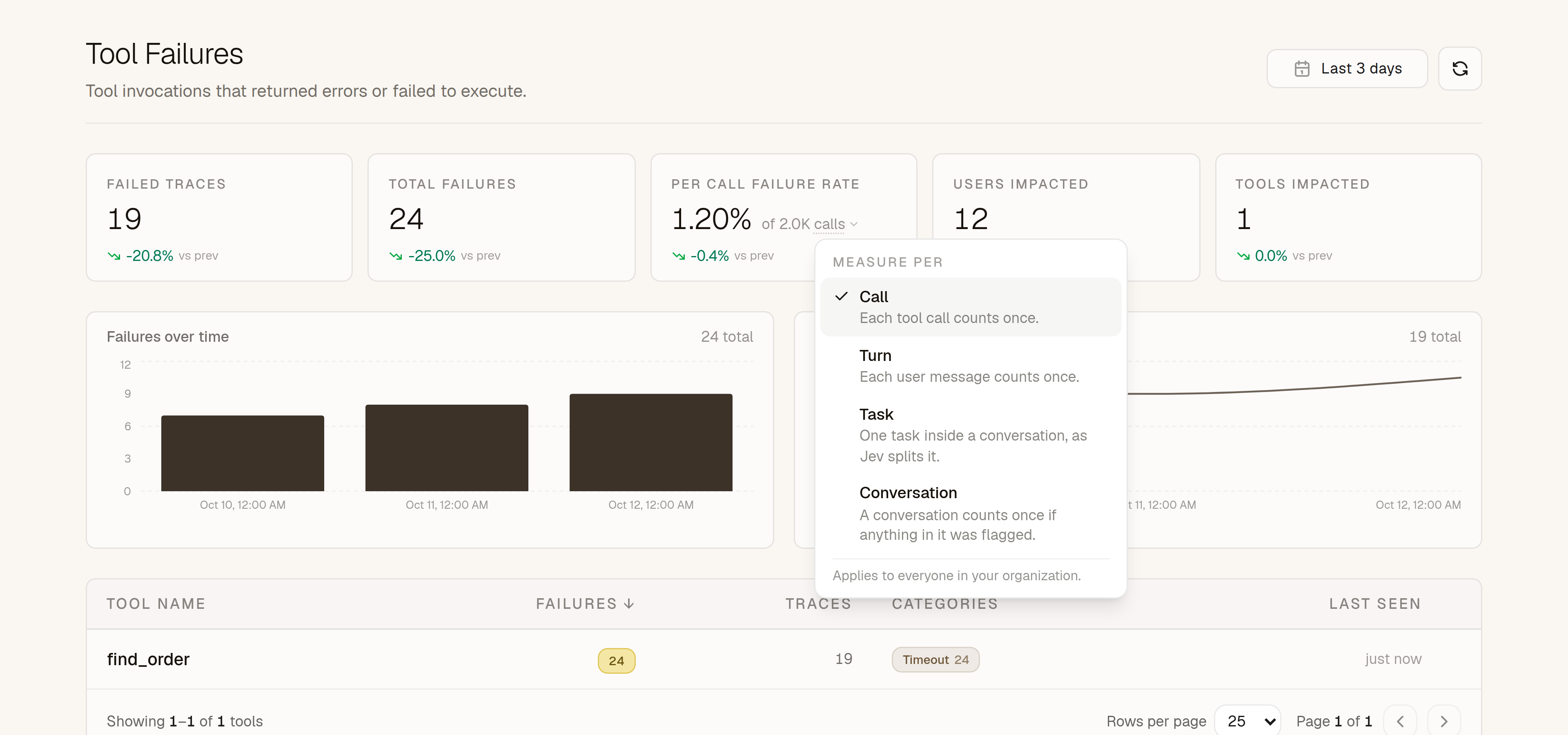
A failed tool call can tell you how reliable a tool is. The same failure also affects a conversation. We now let you choose which view of that failure you want to follow.
For example, several failed calls in one conversation count once in the per-conversation rate. The per-call rate measures the share of calls that failed. The unit beneath the number opens the choices available for that signal.
Tool Failures starts per tool call, and Hallucinations starts per checked claim. User Emotion and Laziness start per user turn, meaning one user message.
Owners and admins can save a unit for the whole workspace. Other members can change it in their current view, and a shared link carries that choice. Overview cards and Home pin headlines follow the saved units.
The charts below the signal stats keep their existing units. Task rates show their coverage start date. They omit a comparison when the previous period lacks coverage.
Traces described by their tasks
Traces now show the user's tasks, with a goal, status and latest step. Search results include the task that matched your query.
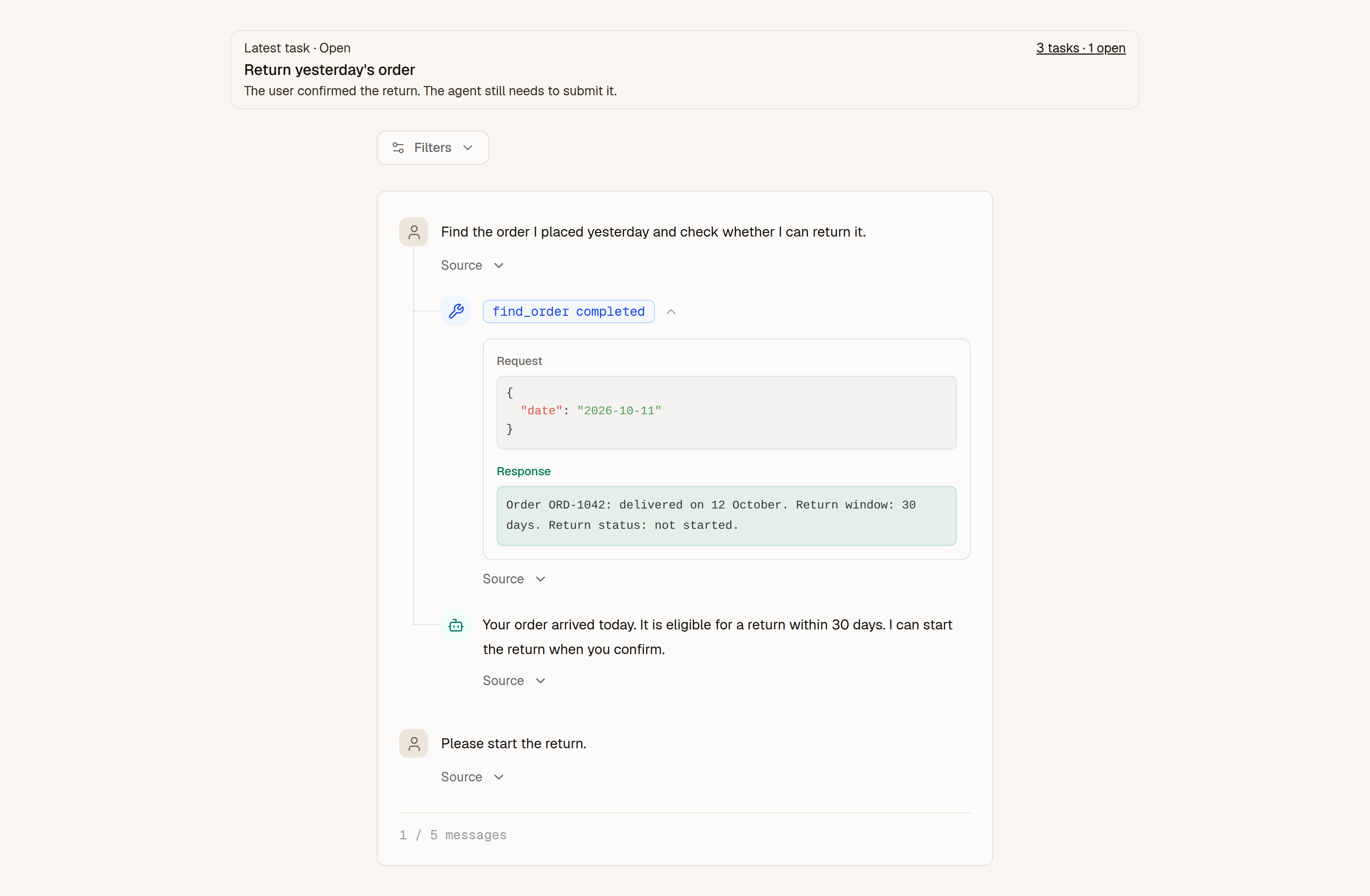
A long conversation can contain several separate requests. A user might ask a product question, look up an order and then start a return. We now describe those requests as tasks, so their goals and outcomes stay separate.
An open task appears first, so work that still needs a response stays visible. The task count links to the full list. The Data API, CLI and Modesius also use tasks for semantic conversation search. Traces without task data keep their existing description.
We also updated the task grouping used by search and Use Cases. This change is enabled by workspace. Open tasks stay searchable, while finished tasks feed Use Cases. Earlier history keeps its existing groups.
Tool results now sit with the calls that produced them. Injected context has its own disclosure, separate from the user's words.
User health across conversations
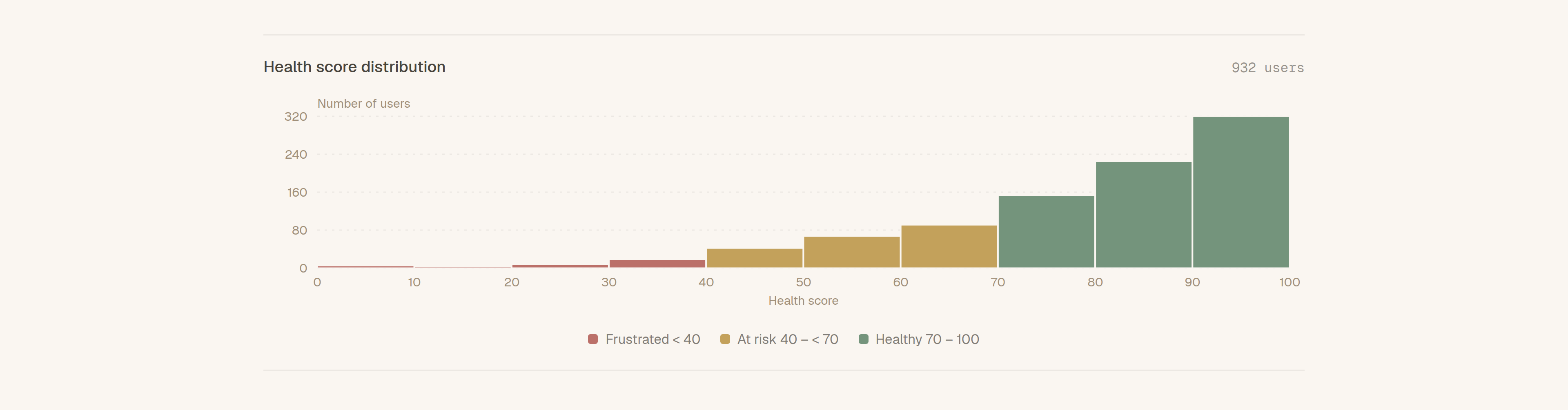
User health now combines problems across conversations. We also added a score histogram to the Users page.
Frustration is one part of how a conversation went. Failed tool calls, contradicted claims and skipped work can affect the user too. We have changed the score to account for those failures, context problems and other negative emotions.
The score accounts for conversation volume and problem severity. Several failures in one conversation have a limit on their combined effect. A linked problem does not count the same signal twice.
The health bands stay the same: Frustrated below 40, At risk from 40 to below 70, and Healthy from 70 to 100. Each bar shows the user count in a score range. Hovering shows the count and its share of the chart. The chart covers users with a user ID in the selected period.
Home's Frustrated users metric now uses these health scores. The formula can change a user's score even when their traces stay the same. It helps you find users who need attention, with their conversations available to check what happened.
A dedicated Problems page
We have moved Problems onto its own page. It brings together findings, the people they affect and the evidence behind them.
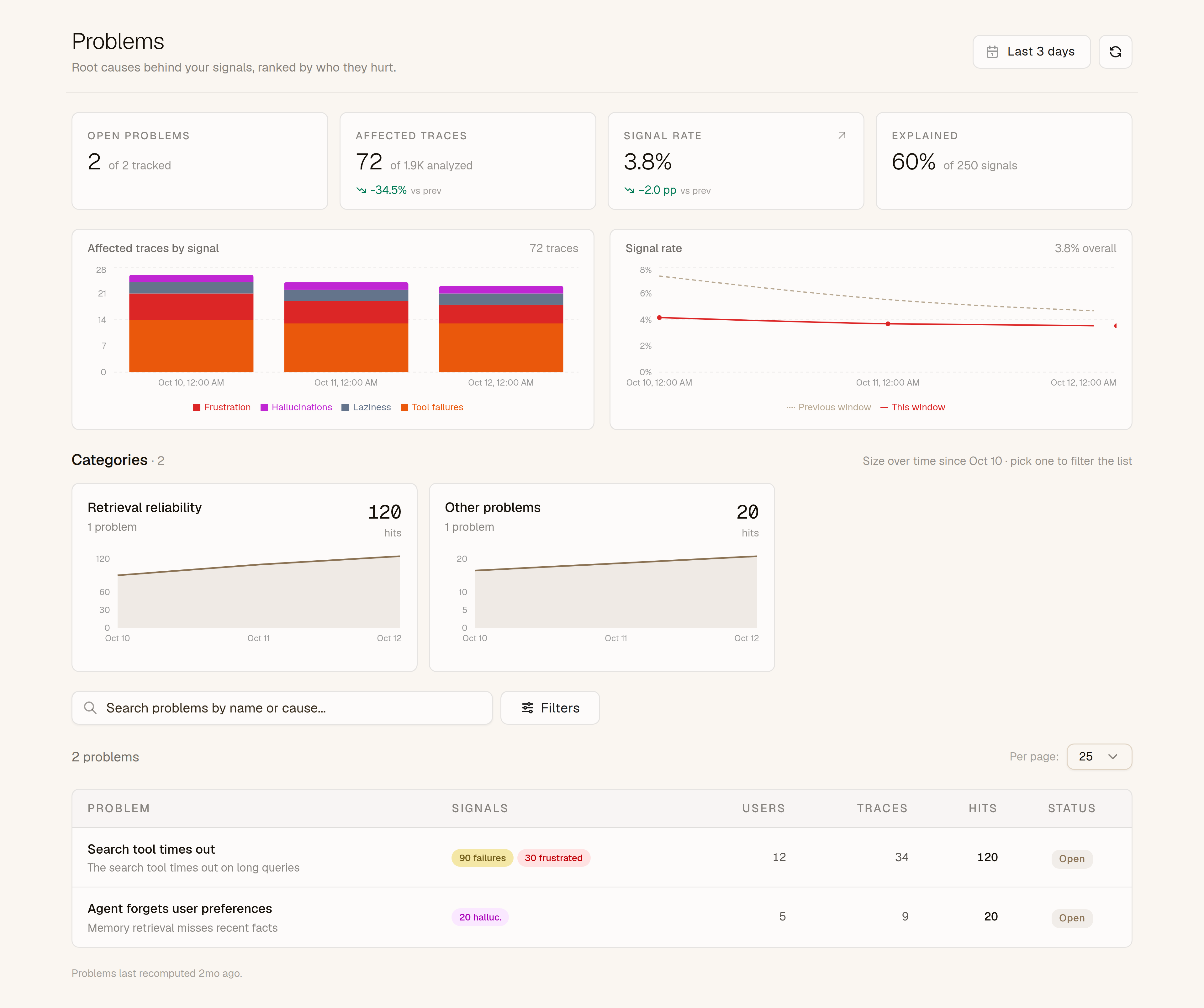
Category cards show related problems and how their size changes over time. You can select a category, search by a problem's name or cause, or filter by signal, status and verification.
Opening a trace brings up a side panel with the finding and its evidence. You can mark it as a false positive or open it in your coding agent. View full trace takes you to the relevant message, with cited times shown in your time zone.
Home and Problems start with the last three days. You can choose a longer period in the date picker.